PCI Logo Development Deep Dive
A logo is a key element to a successful brand identity. For most potential customers or clients, it’s the first impression they have with a company. Immediately, many judgements can be made, though they might not all be true. A company’s personality or energy, the type of experience a customer will encounter, the level of quality of advertised service or product, even what this service or product will cost, can all be reflected in a logo. For these reasons, it’s vital to ensure your company’s logo embodies your corporate personality and product or service being sold.
When embarking on a logo rebrand, like the one we created for PCI, Eleven Peppers Studios (EPS) meets with our clients to gather as much data we can to help influence or design decisions. Most times we like to know: Who is your primary demographic? What is your corporate culture? How would you like to see your business grow? How would you like your business to be perceived? How does your company differentiate from the competition? Along with many more questions…
PCI was facing a pivotal moment in their history. Not only were they about to celebrate 10 years in business but they had outgrown their name, formerly PCI Strategic Management. Their old name did not accurately encompass all of the unique services they provide and could mistakenly pigeon-hole them as “just” a strategic management company. This combined with a logo design that could be perceived as outdated, is a perfect recipe for a rebrand!
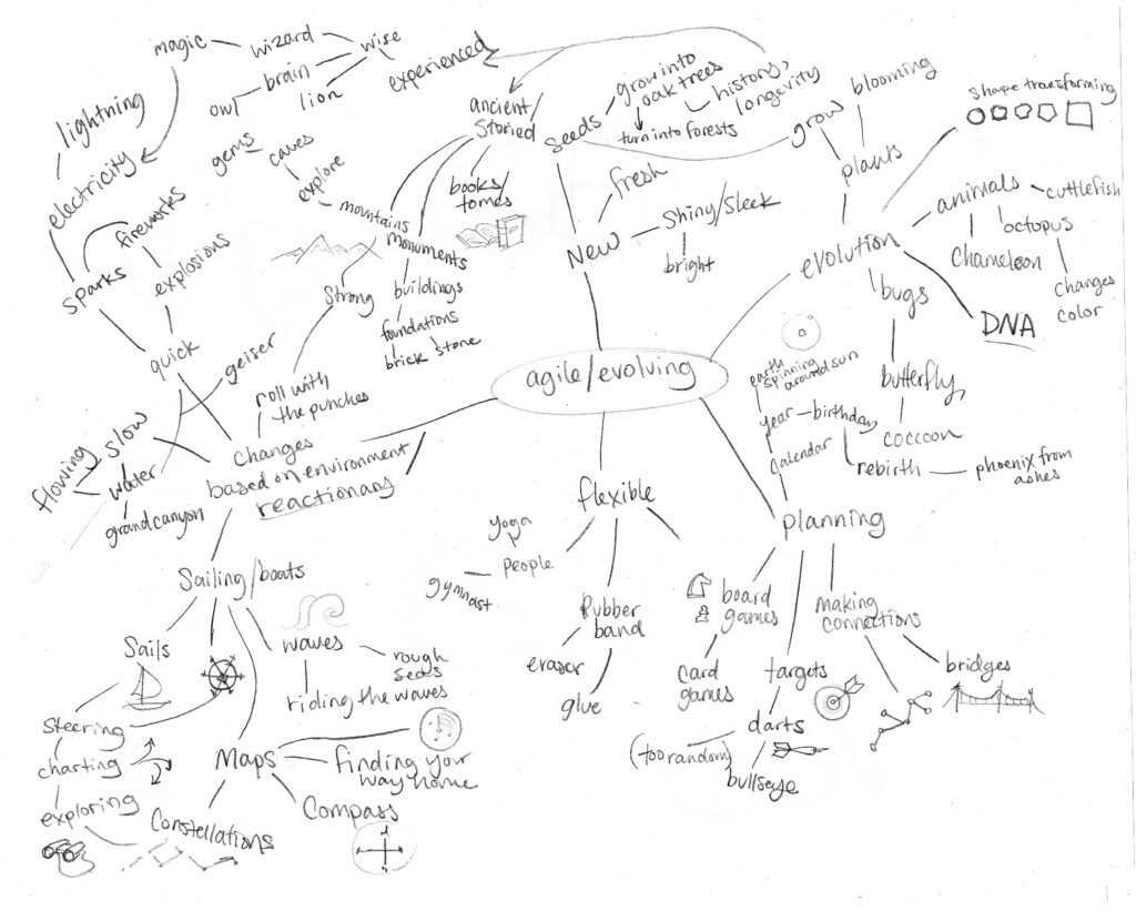
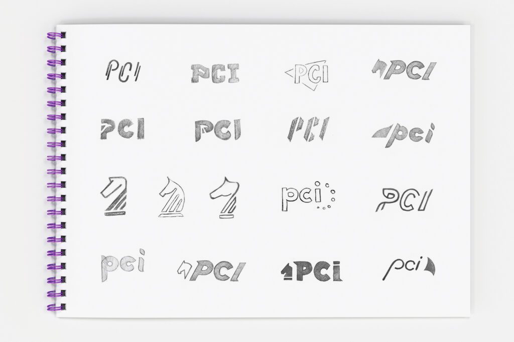
Lucky for EPS, PCI was completely open to our creative process. After doing extensive research and gathering information on PCI, like an Autumn squirrel hoarding nuts, EPS begins the mind mapping and sketching phase. It’s best to get several Peppers involved in this process since designing a logo is no easy feat. A simple solution can take months (and months) of sketching and revisions. Below is a snapshot of some of our sketching and logo development process.
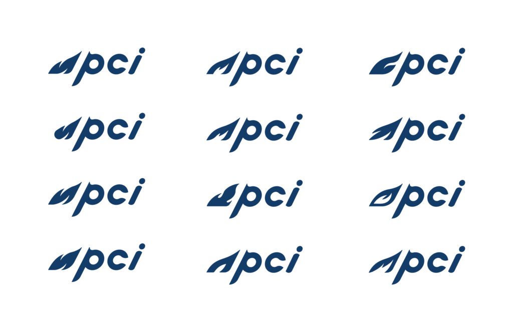
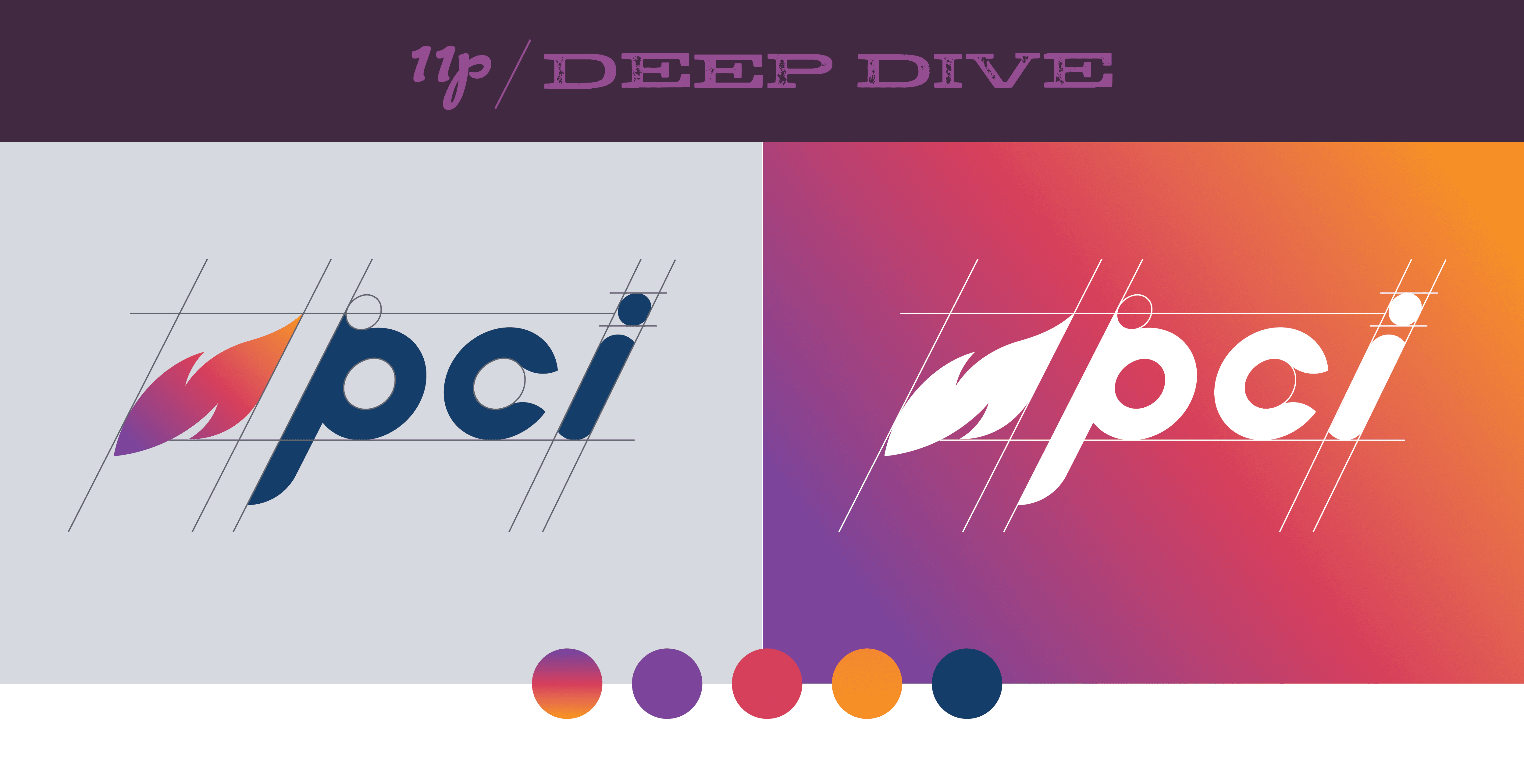
PCI’s initial logo was conservative, unimaginative and most importantly did not reflect their corporate brand. The final PCI logo solution incorporates the flame symbol that was subtly visible in their previous logo but now in a modern and energetic way. The dynamic nature of the flame represents PCI’s expansive capability offerings and reach as a firm. This dynamic mark combined with the movement of the typography, represents the role PCI plays in overcoming challenges. Overall, the forward motion of the logo is a fitting metaphor for PCI’s ability to adapt to the evolving needs of their customers.
We’re so pleased with how we’ve been able to evolve this brand and look forward to expanding this style and this energy to the rest of their marketing collateral and website.
